Most backsplashes that look dated were not bad choices. They were the wrong choice for the room. The tile was picked on its own, under bright showroom lights, because it looked exciting that day. A few years later the rest of the kitchen moved on and the backsplash stayed stuck in the year it was bought.
If you want a backsplash that won’t date quickly, the fix is almost boring. Stop treating the backsplash as the star. The most timeless backsplash is usually quiet, simple, and correctly related to the countertop. It does its job and then settles into the overall design instead of fighting the rest of the room. That is the whole secret, and it is the opposite of how most people shop for tile.
In this guide we walk through the way we actually choose a backsplash on a kitchen remodel, in the order that keeps it looking right for ten or fifteen years instead of two. None of it is complicated. It is mostly about sequence, undertone, and resisting the one trendy tile that is going around at the moment.
Start With the Countertop, Not the Backsplash
This is the single rule that fixes most backsplash regret. Do not choose the backsplash first. Choose it after the countertop is decided.
The countertop is the bigger surface, it carries more colour, and it usually has some movement or veining. Quartz, marble, and natural stone all pull the eye, and that is fine. The backsplash should support the counter, not compete with it. When you reverse the order and fall in love with a tile first, you end up forcing the countertop to match the tile, and that is where kitchens start to look off.
Think of it as a lead and a supporting role. If the countertop has a lot going on, the backsplash plays the supporting role and stays calm. If the countertop is plain, the backsplash has a little more room to add texture or a soft colour. Either way, the counter sets the direction and the backsplash follows it. Get the order right and half of the work is already done.
White Is Not Just White: Match the Undertone
Here is the mistake that quietly ruins a lot of nice kitchens. People pick a white tile, a white quartz, and white cabinets, assume they all read as white, and then wonder why the finished kitchen feels slightly muddy.
White is not one colour. Every white, cream, beige, and grey has an undertone hiding inside it. One white leans pink, another leans yellow, another leans grey or green. A classic subway tile that looks crisp on its own can turn dingy next to a counter that runs warm, simply because the undertones do not agree. The same goes for grout. The grout lines you choose change the whole look more than people expect.
The fix is to match the undertone of the backsplash to the countertop, not to the cabinet in isolation. The counter is the surface the tile sits right above, so that relationship matters most. Pull a real sample of the tile and a real sample of the countertop and study them together in your own kitchen light, not the showroom.
One more practical tip that we use on every kitchen. Stand the tile sample up vertically, in the same position it will actually be installed, with a plain white sheet of paper behind it. Tile reads completely differently lying flat on a counter under store lighting. Standing it up against white shows you the true colour and the real undertone, and it saves you from a backsplash that looked perfect in the shop and wrong on the wall.
If the Countertop Is Busy, the Backsplash Should Be Calm
When a countertop already has strong veining or several colours, the kitchen has enough movement. Adding a busy patterned tile on top of that gives you two surfaces shouting at the same time. The eye does not know where to land, the room feels restless, and that restless look is one of the first things to feel dated.
This is where a neutral backsplash earns its place. A simple white tile, a soft greige, or a quiet stone in the same family as the counter lets the countertop be the focal point while the backsplash holds everything together. The goal is a cohesive look, not a contest. A calm backsplash behind a dramatic counter almost always ages better than two design details competing for attention.
Slab backsplashes are worth a mention here. Running the same stone from the counter up the wall gives you a seamless look with no grout lines at all, which keeps things clean and timeless. It is a popular choice in modern kitchens for exactly that reason, and it removes the undertone problem entirely because the counter and the backsplash are literally the same material.
The Tile Shapes and Patterns That Date the Fastest
There is always a current trendy tile going around. It changes every few years, and it is usually the thing that dates the kitchen the fastest, because the day it stops being everywhere is the day your backsplash starts to look like a specific year.
The shapes and patterns to be careful with are the ones that are clearly of-the-moment: skinny stacked tile run vertically, laser-cut geometrics, busy mosaics, heavy chevron pattern work, and complex patterns that turn the wall into a feature. They photograph well and they are fun in the showroom, but a backsplash tile trend is exactly the thing you do not want carved into a permanent surface in your home.
That does not mean every shape is risky. A classic subway tile in a simple running bond has lasted for a hundred years and is not going anywhere. A soft herringbone pattern can read as timeless when the tile itself is plain and the colour is quiet. The pattern is fine. It is the loud, of-the-year version of the pattern that gets you in trouble. When in doubt, choose the calmer layout and let the colour and material do the talking.
If you are also thinking about cabinets while you plan, the same logic applies, and we wrote about it in our guide to kitchen cabinet choices that won’t look dated. Timeless is mostly about restraint in both places.
Materials That Pass the Test of Time
Material matters as much as shape. Some tile choices simply hold up better, both visually and in real daily use.
Ceramic and porcelain tile. Simple white subway tiles in ceramic or porcelain are the safest timeless choice for a reason. They are a popular choice, they are easy to clean, they work with almost any cabinet, and they never announce a specific year. Porcelain tiles in particular are tough and low maintenance, which matters behind a stove.
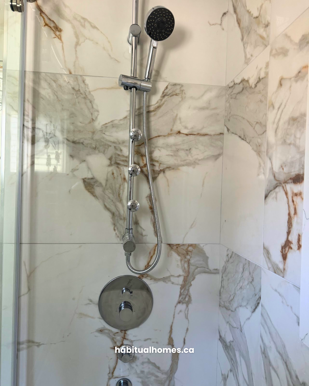
Natural stone. Marble, limestone, and other stone backsplashes bring quiet texture and a classic look that does not rely on a trend. Stone asks for a little more care and sealing, so it suits people who like the lived-in patina rather than a flawless surface.
Glass tiles and metal tile. Glass tiles and metal tile, including a brushed stainless steel sheet behind the range, can look great, but they read more modern and more specific. They are fine as a deliberate choice. Just know they tend to feel of-a-moment faster than ceramic or stone.
Finish is part of this too. A matte finish usually ages more gently than a high shine, and it hides water spots and fingerprints better, which keeps the kitchen feeling calm. Pair a quiet white tile with white cabinets and a soft grout, and you have a backsplash that disappears into the room in the best way.
When You Do Want Colour or Texture
Timeless does not have to mean colourless. If you love colour, you do not have to give it up. You just have to handle it the right way so it reads as a choice and not as a phase.
The rule we follow is simple. If you want colour, choose a solid colour tile, not a busy pattern. A block of one calm colour ages far better than a loud patterned tile, because there is no competing pattern to go out of style. A muted green, a soft blue, a warm clay tone in a zellige tile can all be timeless when the colour is right and the shape stays classic.
The second half of that rule matters just as much. Repeat the colour somewhere else in the room. A backsplash colour that shows up nowhere else looks accidental, and accidental is what feels dated. When the same tone appears in a stool, a light fixture, a runner, or the window trim, the backsplash reads as a planned part of the colour scheme. That connection to the rest of your decorating is what makes a coloured backsplash feel intentional and lasting.
This is also the moment to remember the countertop rule. Colour and texture work best when the counter is on the simpler side. If your countertop is already busy, keep the backsplash quiet. If it is plain, that is your room to play.
A Simple Way to Choose a Backsplash That Won’t Date
Here is the short version we use on every kitchen, in order:
- Lock in the countertop first. Everything else relates back to it.
- Identify the dominant undertone in the counter, whether it is warm white, cream, greige, or cool grey.
- Choose the quietest tile that repeats that undertone. The backsplash should agree with the counter, not introduce a new direction.
- If the counter is busy, go neutral. If the counter is simple, you can add a soft texture or a solid colour.
- Keep the shape classic. Skip whatever tile is everywhere this year.
- Test the real samples vertically, against white paper, in your own kitchen light, before you commit.
If a tile passes all six, it will not impress anyone in the showroom, and that is the point. The goal is not a backsplash that wows you on day one. The goal is a backsplash that still looks right years later, because it was never trying to be the star.
When we plan a kitchen renovation, we look at the backsplash, the countertop, the cabinets, and the lighting as one decision rather than four separate shopping trips. As a licensed Toronto design-build studio, we coordinate the whole kitchen in house, including our own licensed electrician and plumber, so the finishes you choose are the finishes that actually get installed, with nothing lost between the design and the build.
Frequently Asked Questions
What backsplash never goes out of style?
A simple white ceramic or porcelain subway tile is the closest thing to a backsplash that never dates. It works with almost any cabinet, it is a popular choice for a reason, and it keeps the countertop as the focal point. Natural stone in a quiet tone is a strong second option.
Should the backsplash match the countertop or the cabinets?
Relate the backsplash to the countertop first. The counter sits right below the tile and carries the most colour and movement, so the undertones need to agree there. The cabinets matter too, but the counter is the surface that makes or breaks the cohesive look.
Is subway tile still timeless?
Yes, when it stays simple. A classic subway tile in a plain colour and a standard layout has lasted for over a century. The versions that date are the loud ones, such as high-gloss bold colours or a trendy stacked pattern. Keep the colour quiet and the layout calm.
What backsplash is easiest to keep clean?
Porcelain tile and a full stone slab are the easiest to maintain. Fewer grout lines mean less scrubbing, so a slab backsplash or large-format porcelain wins on ease of cleaning. A matte finish also hides water spots and fingerprints better than a high shine.
Should a backsplash go all the way to the ceiling?
It can, and a full-height backsplash behind a range or sink is a clean, timeless look. The key is the same as everywhere else. The taller the tile runs, the more important it is that the tile is quiet, so it reads as a calm background rather than a giant feature wall.
What backsplash to avoid?
Avoid whatever tile is everywhere this year. Skinny stacked verticals, laser-cut geometrics, busy mosaics, and loud high-gloss colours date the fastest. Also avoid choosing the backsplash before the countertop, since it usually clashes with the counter undertone. Keep the shape classic and the colour quiet.
Should the backsplash be lighter or darker than the countertop?
There is no fixed rule, but a backsplash in the same tone or slightly lighter than the countertop usually reads as the calmest and most timeless. A much darker backsplash tends to pull attention away from the counter. What matters more than light or dark is that the undertones agree.
Planning a Kitchen Renovation in Toronto?
A backsplash is one small detail in a kitchen, but it is the kind of detail that tells you whether the whole room was planned or just assembled. When the countertop, the tile, the cabinets, and the lighting are chosen together, the kitchen holds up. When they are chosen one trip at a time, it shows.
If you are planning a kitchen and want every finish to work as one cohesive design, take a look at our kitchen renovation services in Toronto, or keep reading on the finishes that shape the look, starting with our guide to countertop edge profiles. When you are ready, book a consultation and we will help you choose finishes that still look right long after the trends have moved on.