Ever walked into a living room and immediately felt like curling up with a cup of cocoa, or perhaps felt invigorated and ready for a lively chat? More often than not, it’s not just the comfy couch or the snazzy decor that’s setting the vibe—it’s the paint colour. Yep, those walls have got more power than you might think.
Imagine this: A room bathed in a warm, sunset-like orange, evoking thoughts of cozy fall evenings. Now, picture a living space with walls painted a soft, serene blue, reminding you of a peaceful morning sky. Feel the difference? That’s the magic of paint!
Alright, so we’ve established that the colour of your walls can basically be a mood ring for your room. But let’s dive deeper, shall we?
The Warm Side of the Palette
What’s the deal with warm colours? Warm shades are those hearty hues that make you think of sunlight, fireplaces, and maybe that one spice-scented candle you can’t live without. We’re talking about reds, oranges, yellows—the colours of fire and sun.
Pros: Walking into a room with warm colours can feel like receiving a giant bear hug. It’s cozy. It’s intimate. It’s the sensation of wrapping yourself in a soft blanket on a cold day.
Cons: Beware, though! Too much of these, and you might just end up feeling like you’re inside a furnace. These vibrant shades, when overdone, can sometimes feel a smidge overwhelming.
Taking a Dip in Cool Colors
What about the cool crew? These are the colours that whisper breezy beach days and clear night skies. Think blues, greens, purples—like that refreshing sip of iced tea in summer.
Pros: Cool colours often have a calming, Zen-like effect. They can make a space feel larger, airier, and super chill (pun totally intended). Perfect for those who want their living room to be a sanctuary of calm.
Cons: On the flip side, if you’re not careful with your shade choices, you might end up with a room that feels more like an icebox than a relaxing retreat.
Alright, by now, you might be wondering: “Cool, cool (or should I say warm?), but which is better for my living room?” Well, stick around as we dive into some hot (and cool) Q&As in the next section. Spoiler: There’s no wrong answer, just what feels right for you.
Your Burning Questions Answered
Should a living room be a warm or cool colour?
Alright, confession time: I wish there were a one-size-fits-all answer I could just hand over. But much like choosing between cake or ice cream (because who can really pick just one?), it boils down to personal preference and a few other sneaky factors—got a space that’s a bit on the small side or lacks natural light? Cool colours give it that open, airy feel. On the other hand, if you’ve got a cavernous living room that feels more like an echoing hall, warm colours can make it feel like a cozy nook.
What’s the hottest (or coolest) colour for living room walls right now?
Trends, trends, trends! They’re as changeable as the weather. Lately, though, I’ve been seeing a lot of earthy, muted tones, think sage greens or dusty blues. But who knows? Next year, we might all be raving about electric purple! 😜
Colors that jive well in living rooms
I’m all for freedom of expression, but if you want a couple of classic combos, here you go:
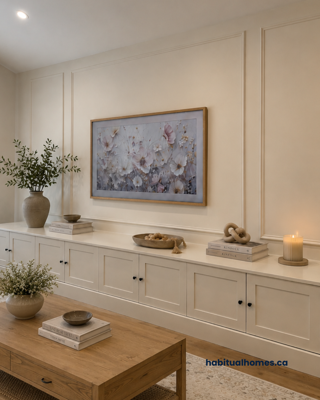
Warm palettes: Terracotta orange, creamy beige, and a splash of deep red.
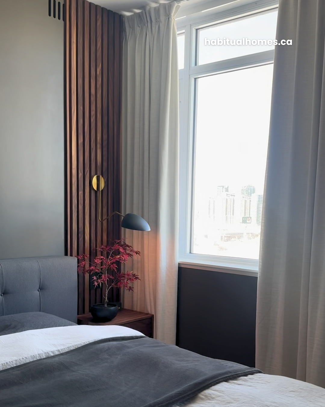
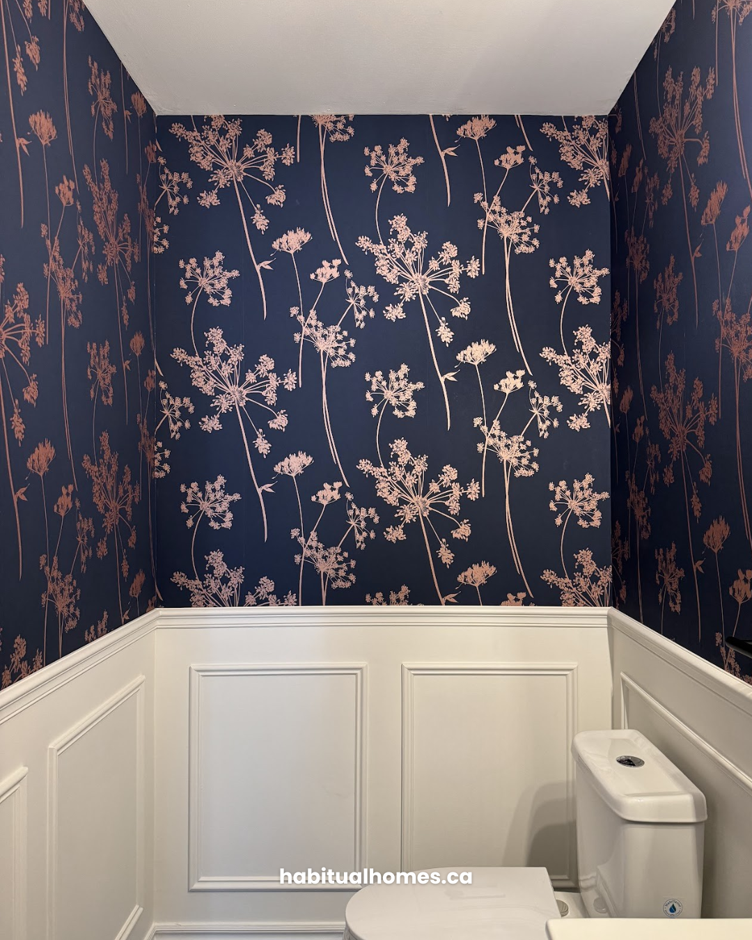
Cool palettes: Soft aqua, gentle lavender, and a hint of deep navy.
How do I choose a colour scheme for my living room?
Ah, the million-dollar question! Here’s a quick step-by-step:
- Start with Inspiration: Got a favourite rug or piece of art? Draw colours from things you love.
- Think of the Mood: Want a calm retreat? Go for muted, soft shades. Want a lively chat room? Vibrant might be your jam.
- Test, Test, Test: Before you commit, get a few samples. Paint a patch and see how it feels at different times of the day.
- Balance with Neutrals: A good rule of thumb? 60% dominant color, 30% secondary color, and 10% accent color. Keeps things harmonious.
How do you choose between cool and warm colors?
First, think about how you want to feel in that room. Relaxed and calm? Cool might be your alley. Cozy and comfy? Warm’s got your back. Here’s a pro tip: Look at the color wheel. Colors on the left are generally warm (reds, oranges, yellows), and those on the right are cool (blues, greens, purples).
Do I want warm or cool paint?
It’s like asking if you’re a summer or winter person. Warm paint can make spaces feel inviting, intimate, like that snug coffee shop on the corner. Cool paints, on the other hand, are like a breath of fresh mountain air—open, fresh, serene.
If you’re still scratching your head, think about the stuff you have in your room. Got a lot of wooden, earthy furniture? Warm might complement that. More glass, metal, and modern vibes? Cool could be the way to go.
Is Grey a cool or warm colour?
Grey, oh grey. It’s like the chameleon of the paint world. Sometimes, it’s cool hanging out with its blue or purple undertones. Other times, it’s warm, cozying up with some beige or brown. So, in the timeless words of that song, “It’s not about black or white”… because it’s all about the grey in between.
Bring it Home (Literally)
Alright, armed with all this new paint wisdom, are you ready to commit? Just remember, paint isn’t a lifetime commitment. If you end up hating it, you can always start over (though I’ve got a feeling you’re going to nail it the first time).
Join the Color Conversation! Drop your favourite paint hues, any questions, or your before-and-after living room makeovers in the comments. Can’t wait to ooh and aah over them!
Feeling artsy? Share your revamped living spaces on the gram. Just slap on #LivingRoomRevamp, and let’s inspire each other.
And hey, if you’re ever in a paint predicament again or need more homey tips, you know where to find us. Habitualhomes.ca/contact