You’ve probably saved a kitchen on Pinterest and thought, “I want exactly that.” Good. Choosing kitchen colors that go together starts with copying. Every designer copies. I do too. The difference is knowing what to copy from the photo, and what to adapt so it works in your house.
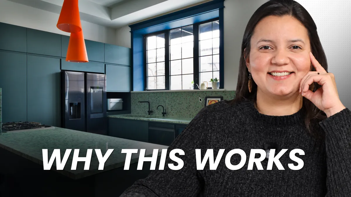
In this video, I break down a kitchen designed by Olbos Studio, with blue-green cabinets, a green terrazzo countertop, deep blue trim and orange accents. We’re not copying the style. We’re copying the thinking behind it, and that works in any kitchen, colorful or neutral.
Below is the written version: the formula, the order to make each decision, and the one thing you should never copy straight from a photo.
The Formula: Think of Your Kitchen Like an Outfit
Almost every outfit that works has four parts. So does almost every kitchen that works.
- A base. Your neutral basics. In this kitchen, white walls and a light wood floor.
- One statement piece. The thing people notice first. Here, the blue-green cabinets and the green terrazzo counter.
- A second layer that frames everything. Deep blue trim around the windows and doors.
- An accent that repeats. Orange, in the lamp and in the old brick.
If you don’t design kitchens for a living, follow this formula. It’s like cooking a new dish: the first time, you follow the recipe exactly. Once you understand why it works, you start changing ingredients.
What I see a lot is the opposite. Homeowners mix five ideas from five photos in their first kitchen, and they find out it doesn’t work when everything is already installed.
Choose in the Right Order: Hardest to Change First
Copying the formula is easy. Copying the colors is where people get in trouble, because colors only work when you choose them in the right order.
Most people start with the paint color. That’s backwards. Start with the decision that’s hardest to change, because that decision sets the rules for everything else.
Here is the order I follow:
- The first big decision (what you’re keeping)
- Countertop
- Floor
- Cabinets
- Trim
- Wall paint
- Accent
1. The First Big Decision Sets the Rules
In this kitchen, it was the brick. They didn’t have to keep it exposed. They could have covered it and painted it white. Keeping it was a choice, and once they made it, the brick started making decisions for them. Every color after that had to get along with orange-red brick.
In your house, it might be the floors you’re keeping, a fireplace, or a stone you already love. Whatever it is, decide it first. It will decide the rest.
2. Countertop Before Paint
There are thousands of paint colors and only a few countertops you’ll really love. Paint can follow the counter. The counter can’t follow the paint.
Here, the counter and backsplash are the same terrazzo. No grout lines, so you just wipe it. The trade-off is that it’s one of the hardest things to change in a kitchen, so ask how it’s made before you fall in love. Some terrazzo can stain or get dull marks from lemon and vinegar. Other types resist stains but don’t like hot pans. If you’re comparing stones, our post on quartz countertops vs marble walks through the same kind of everyday trade-offs.
3. A Floor That Lets Your Eyes Rest
Light wood in a herringbone pattern. With this much color, your eyes need a calm place to land, and that’s the floor’s job. Keep in mind that herringbone takes more labour to install than straight boards, because every piece is cut and placed by hand. If your cabinets are wood too, here’s how to tell whether your kitchen cabinets should match the floor.
4. Cabinets: Never Copy the Paint Color
This is the one thing you should never copy straight from a photo.
The blue-green of the cabinets and the green in the terrazzo are not the same color, but they get along. They share the same base color underneath, what designers call the undertone. That paint works here because it was matched to this counter and this brick. Next to your counter and your floor, it can look completely wrong.
So copy the idea, not the paint code. Bold cabinets matched to the counter. Then find your own color with real samples, side by side, all together. If you’re working with existing cabinets, read should you paint your existing kitchen cabinets before you pick up a brush.
The shape matters too. Shaker doors, with a simple frame around the panel, feel at home in older, traditional houses. Flat doors feel at home in modern ones. And pick which one talks: here the color does the talking, so the shape stays quiet. When both the color and the details want attention, the kitchen starts to feel busy.
5. Trim Follows the Cabinets
They kept the thick old trim and painted it deep blue, right next to blue-green cabinets. Same family. The trim color came from the cabinets. You can use the same color, a darker or lighter version, or another color from the same family.
If your kitchen is open to the rest of the house, this matters even more. In this home, the trim goes around every window and door on the floor. The trim is what carries the kitchen into the rest of the house. That’s also why it’s not a small decision: changing it later means sanding, priming and painting every window and door.
6. Wall Paint Comes Last (and That’s Good News)
With thousands of options, wall paint is the easiest piece to match once everything else is set. Test it next to your real samples, in your own light. Our guide on the effect of lighting on paint explains why the same color can look different from room to room.
Want help with this step? Our Kitchen colour consultation chooses your paint with your countertop, floor and cabinets, and gives you the codes.
7. The Accent: The One Thing You Can Copy Almost Directly
Here the accent is orange, and it doesn’t feel random because it picks up the color of the brick. It repeats in the dining room too, in a chair and the plant pots. One orange thing looks like an accident. Two looks like a plan.
A lamp, a chair, a pot. If you get tired of it, you change it in an afternoon.
When Breaking the Formula Works
This kitchen breaks a rule. Flat modern doors usually belong in modern houses, and here they sit in an old townhouse next to old trim and old brick. It works because the contrast is clear: the old parts look truly old and the new parts look truly new.
It’s like wearing sneakers with a tailored blazer. It looks great, but only when it’s clearly on purpose. That’s the difference between breaking a rule and not knowing it exists. One looks like a decision. The other looks like a mistake.
Timeless or Committed?
People call kitchens like this timeless. I’d say committed. Bold hard finishes are like a tattoo: you can remove them, but it takes time and money. If you change your mind about the counter, the floor, the cabinets or the trim, it’s a renovation, not a weekend project.
That doesn’t mean don’t do it. It means know what you’re signing up for. If you prefer a calmer palette, see our kitchen cabinet choices that won’t look dated.
Frequently Asked Questions
What should I choose first when picking kitchen colors?
Start with what you’re keeping or what’s hardest to change, like an existing floor, a fireplace or the countertop you love. Then choose the countertop, floor, cabinets and trim, and leave wall paint for last.
Can I copy a kitchen from Pinterest?
Yes. Copy the formula and the order of decisions. Adapt the specific paint colors, because they were matched to finishes and light you don’t have.
How do I know if my cabinet color goes with my countertop?
Look at the undertone, the base color underneath. Put a large paint sample right next to a real piece of your countertop and your flooring, and look at them together, not one at a time.
Should trim match the kitchen cabinets?
It doesn’t have to match exactly, but it works best when it comes from the cabinets: the same color, a lighter or darker version, or a color from the same family. In open-concept homes, the trim is what connects the kitchen to the rest of the floor.
Your Next Step
Knowing the formula is the first half. The second half is doing it in your own kitchen: finding the decision that sets your rules, reading the undertones, and testing your samples together before you spend anything.
I made a free step-by-step video for that, with a printable checklist. It’s on Habitual Homes Learn, our free platform for homeowners. You just create a free account.
And if you’d rather have me choose your colours with your countertop and your floor, book a kitchen colour consultation, in your home in the GTA or remote. You can also see how we approach full projects on our kitchen design Toronto page.